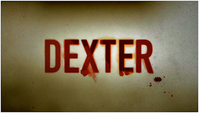
Critique on Dexter for its Title Design
I shall not say that the title design of a film makes or breaks it. But one has to understand that a film/TV show begins with it. It has the power to create anticipation, suspense and excitement. If you think about, it probably puts the viewer in a positive or negative frame of mind, depending on the quality if it and that’s pretty much making or breaking of the film.
One of the title designs that I cannot seem to forget is TV series Dexter’s. A winner of the Emmy for Outstanding Title Design in 2007, it is worth all the praise. Here’s why.
The premise of Dexter is his basically seemingly regular life. Dexter is a blood spatter analyst at the Miami Metro, but he’s also a serial killer. So kills vandals at the night. To everyone, he’s a quiet, smart guy working for the Miami Metro, but no one knows he’s more than what meets the eye. His life revolves around carrying on with his dual life and keeping it a secret.
A good title design lets you know the gist of the show in a less than a minute. A good title design tells you about the story, yet keeps you wanting for more. Dexter’s title design does exactly that.
The title design depicts the innocent morning routine Dexter carrying in a way that makes Dexter’s darkness obvious. It begins with a close-up shot of mosquito resting on Dexter’s arm and he killing. He proceeds to give his face a shave. He continues with making his breakfast and then eating it. The close up shots of him cutting out the meat piece, making eggs and squeezing out juice looks absolutely morbid. I must applaud the production design team for replacing the regular oranges with blood oranges.
Dexter then further ties his shoe laces and then wears his t-shirt which is shot in a way that looks like a man tieing someone up and then covering his face. Its brilliant cinematography team manages to make his morning routine look like no less than a murder scene.
With the case of Dexter, the plot of the show itself keeps the viewers glued. The show could have had snapshots or scenes of his day for the show’s title design. But that might have put off some of the viewers. This cinematographic brilliance added value to the show. It is not a surprise it was the favourite part of the show for its viewers.
Bibliography
Blue Lightning TV (2014) Photoshop: How to create a 3D,
cinematic, movie title design. Available at:
https://www.youtube.com/watch?v=UkBVBxs5-hs (Accessed: 6 April 2016).
Dexter Main title (no date) Available at: http://thisisdk.com/work/showtime/dexter-main-title
(Accessed: 6 April 2016).
PBSoffbook (2012) The art of film & TV title design |
off book | PBS digital studios. Available at:
https://www.youtube.com/watch?v=qbhi-JICKKI (Accessed: 6 April 2016).


