Radio clip


Ten years back, dating someone was unacceptable. Much may not have changed in that regard, but dating is getting acceptance in the society slowly and steadily. With dating being an acceptable social activity, we have a lot of dating apps coming up. One such dating app, Aisle is exclusively made for Indians. In my radio clip, I have recorded a conversation between a hot-shot fashion blogger and her best friend. Her best friend envies all the perks she gets and the exciting events she gets to attend. The girl reveals she’s going out on a date. The conversation ends with she revealing that she’s going out on a date with someone she met on the dating app. I have attempted to remove the stigma dating has in the eyes of the older generation.


Please find my radio clip here: https://www.youtube.com/watch?v=ox7SflUZziE

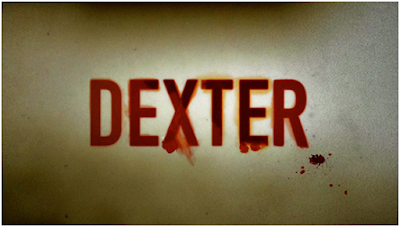
Critique on Dexter for its Title Design


I shall not say that the title design of a film makes or breaks it. But one has to understand that a film/TV show begins with it. It has the power to create anticipation, suspense and excitement. If you think about, it probably puts the viewer in a positive or negative frame of mind, depending on the quality if it and that’s pretty much making or breaking of the film.

One of the title designs that I cannot seem to forget is TV series Dexter’s. A winner of the Emmy for Outstanding Title Design in 2007, it is worth all the praise. Here’s why.


The premise of Dexter is his basically seemingly regular life. Dexter is a blood spatter analyst at the Miami Metro, but he’s also a serial killer. So kills vandals at the night. To everyone, he’s a quiet, smart guy working for the Miami Metro, but no one knows he’s more than what meets the eye. His life revolves around carrying on with his dual life and keeping it a secret.
A good title design lets you know the gist of the show in a less than a minute. A good title design tells you about the story, yet keeps you wanting for more. Dexter’s title design does exactly that.


The title design depicts the innocent morning routine Dexter carrying in a way that makes Dexter’s darkness obvious. It begins with a close-up shot of mosquito resting on Dexter’s arm and he killing. He proceeds to give his face a shave. He continues with making his breakfast and then eating it. The close up shots of him cutting out the meat piece, making eggs and squeezing out juice looks absolutely morbid. I must applaud the production design team for replacing the regular oranges with blood oranges. 


Dexter then further ties his shoe laces and then wears his t-shirt which is shot in a way that looks like a man tieing someone up and then covering his face.  Its brilliant cinematography team manages to make his morning routine look like no less than a murder scene.
With the case of Dexter, the plot of the show itself keeps the viewers glued. The show could have had snapshots or scenes of his day for the show’s title design. But that might have put off some of the viewers. This cinematographic brilliance added value to the show. It is not a surprise it was the favourite part of the show for its viewers.


Bibliography
Blue Lightning TV (2014) Photoshop: How to create a 3D, cinematic, movie title design. Available at: https://www.youtube.com/watch?v=UkBVBxs5-hs (Accessed: 6 April 2016).
Dexter Main title (no date) Available at: http://thisisdk.com/work/showtime/dexter-main-title (Accessed: 6 April 2016).
PBSoffbook (2012) The art of film & TV title design | off book | PBS digital studios. Available at: https://www.youtube.com/watch?v=qbhi-JICKKI (Accessed: 6 April 2016).


Critique on Psycho's Editing

It is editing, they say, that makes or breaks a movie. Top notch footage, great actors, amazing sound designing can all come to waste if it is not edited into a good film.  Naturally, editing is also known as ‘film construction’ or ‘film sculpturing.’ It is literally cutting down of parts that are not required and showing the audience only the part that is important to the storyline.

Alfred Hitchcock’s Psycho’s shower scene is always mentioned in any discussion on editing in films. It was, after all, a game changer. Looking back, the movie as a whole is one brilliant example of film editing. Masterful editing lies in the seamlessness of it. Making a cut or moving to different perspective, a cutaway or insert shouldn’t seem like one. This is brilliantly seen in every frame chosen in the murder-mystery thriller Psycho.


Since the film in question is a murder-mystery, the editing of the movie was of pivotal importance. The editing of the film kept the suspense of the film alive throughout the movie.  The style of editing changed according to the plot of the movie. The murder of Marion Crane in the movie came unexpected. The lady was murdered by being stabbed by a knife while she was showering. Apart from coming as a shock to the viewer and the character, the incident was also gravely gory, a lot more than that could be shown to the views. During the entire scene the viewer does not directly see the knife being directed at Marion’s body, thus cutting out the dreadful details of the incident. Some very brilliant editing is also seen in the murder scene of Detective Arbogast. By this time of the movie, the viewer knows that there is a mentally unstable lady in the storyline. But the viewer still cannot blame her completely. So, the editing is done is such a manner that the viewer can see the lady for just a split second. This scene was another breaking point in the movie. It thickened the suspense of the film further.


The film also established the time scale in the movie really well. One example was seen in the part where Marion is running away from her hometown. One can see clearly that when she began driving, it is evening but it later graduates to the night and to a new day. This is tactfully shown in the same frame. 

Bibliography

Marshall, C. (2006) Alfred Hitchcock’s 7-Minute master class on film editing. Available at: http://www.openculture.com/2013/04/alfred_hitchcocks_seven-minute_editing_master_class.html (Accessed: 6 April 2016).
Name (2009) The power of sound and editing (the conversation and Psycho). Available at: https://cinephilefix.wordpress.com/2009/11/17/the-power-of-sound-and-editing-the-conversation-and-psycho/ (Accessed: 6 April 2016).
P S Y C H O (2010) Available at: http://www.filmeducation.org/pdf/film/Psycho.pdf (Accessed: 6 April 2016).

Critique on Schindler’s List for its Camera works

Films communicate their message in a visual medium. Naturally, the camera works that goes into the making of the film are the most important aspect of any film. One such film that comes to my mind when I think of camera works is Schindler’s List.


Based in the 1940’s, during the outbreak of the World War II, the film tries to show the horrifying violence subjected on the Jews by the Nazis and how Oskar Schindler, a member of the Nazi party and businessman saves lives of hundreds of Jews. Considering the heavy subject matter of the film, Steven Spielberg chose to shoot the movie in black and white, with only a few scenes shot in colour. This gave the film a yesteryear look and muted down the gory violence in the film at the same time.
 The film begins with a Jewish family celebrating the Sabbath. The scene ends with the family lighting a candle, which there on dies and then progresses to the story in black and white. Using a candle as a transition, the film ends with a final scene where real-life Jew factory workers pay homage to Schindler's tomb.


To accommodate the numerous characters in the film, cinematographer Janusz Kaminszki uses wider aspect ratio for every frame. The stark contrast between the glossy Nazi parties and concentration camps come out alive with his cinematography. One of the most iconic and heart-wrenching scenes in the movie is the girl in the red coat. Schindler sees the massacre that takes place from atop a hill and spots a little girl in a red coat trying to hide among refugees. The red coat perhaps symbolises the bloodshed and the atrocities that came about with the genocides.  Spielberg wanted the film to come across as real as possible. Hence, he and
Kaminszki decided to shoot the film documentary style. 40% of the film is in fact with a handheld camera. One example of this technique used in the film is the 17-minute long liquidation of the ghetto. It is one of the most intense and horrifying scenes till date in the history of filmmaking.
Another scene that shouldn’t go without mentioning would be the one where the Jew women and children are brought to the gas chamber by train amidst snowfall. The ashes getting mixed with snowfall and the palpable fear on the faces of the women are shown aesthetically.


Schindler’s List is the definite answer as to remarkable camera works is concerned. But it shines ironically for the limited and intelligent use of it as oppose to the counterparts that depict use of the camera that’s rather over the top.


Bibliography
ARPUTH, J. (2014) A cinematography analysis on Schindler’s list. Available at: http://www.studentfilmer.com/uncategorized/a-cinematography-analysis-on-schindlers-list/ (Accessed: 3 April 2016).
Schindler’s list (1994) Directed by Steven Spielberg .
Stacey Natiuk (2012) Schindler’s list analysis. Available at: https://www.youtube.com/watch?v=9nvR7WICVzI (Accessed: 3 April 2016).


Critique on Wall-E for Sound Design

If you’re anything like me, you’re probably wondering what’s sound design, how does one ‘design’ it and why is it so significant in the making of a film? Let me begin by answering the last question. Replay any film you can think of. Now imagine without any sound. Not only do you lose on the dialogues, but you also lose out on the sounds that set the backgrounds of the movie.  If you still don’t get it, imagine the typical scene where a plane takes off in the movies or lightening striking. Would it make any impact without the sound? Films and TV shows are primarily visual but they’re down to nothing when it comes to visuals without sound, you have close to nothing.

In words of legendary sound designer Ben Burtt, sound design can be defined as the right choice of the right sound at the right moment. Amongst his expletory works, my favourite is the animated Pixar film Wall-E.


The premise of Wall-E is quite imaginary, nothing like that already exists. The namesake protagonist also cannot speak. Hence to create sounds that could explain the plot of the film, the emotions felt lied predominantly on the shoulders of the sound designer. Burtt in an interview explained, he went through a series of experiments to come up with the voice for the central characters, Wall-E & Eva. He began with just making mechanical noises and then further experimented with his own voice. He later realised that the most authentic robot voice when it was humanoid. He recorded the voice of a couple of Pixar employees and synthesised them to sound more mechanic and thus the voices of Wall-E & Eva were formed.  


Despite having the sounds of the characters formed, Burtt had a gigantic challenge ahead. Because the main characters were robots, they had minimal dialogues. The sound team had to rely heavily on the sounds of thuds, both mechanical and machine- made, the swoops and swooshes in space, the slight buzzing on the empty planet. They, in fact, made most of the film.


Wall-E depicted the love story between two robots that barely spoke and little human interaction in it. Yet, it is one of the most touching movies we’ve seen in the past few years. It wouldn’t have been the film it is without the sound design involved in it.


Bibliography
Disjt (2010) The voice of WALL-E. Available at: http://jedsound.com/blog/?p=116 (Accessed: 3 April 2016).
Miller, N. (2008) Making wall-e talk: A Q&A with sound master Ben Burtt. Available at: http://filmschoolrejects.com/news/making-wall-e-talk-a-qa-with-sound-master-ben-burtt.php (Accessed: 3 April 2016).
fartfx3 (2009) WALL E animation sound design part 1. Available at: https://www.youtube.com/watch?v=NsfbXGDw_aA (Accessed: 3 April 2016). 


A critique on Avatar’s Production Design

In the words of the dictionary, the production design is the overall look of the film that illustrates the setting and visual style of the story. It includes the design of the sets, the location choices, costumes and the choice and supervision of props.  But in my understanding, it is everything that our subconscious mind sees and then perceives. Let’s take the example of one my favourite films and the one of the most popular sci-fi films of all time – Avatar.


It’s one thing to recreate something that’s already there and another to create something that never existed. One can only imagine the kind of pressure the film’s production designer, Rick Carter was under to create this masterpiece. The film had two different art departments – one that was dedicated to creating the flora and fauna of the film and the other that looked after the superhuman machinery and the laboratory used by the scientists.
Right from the beginning of the video where the film begins in the laboratory where the scientists are human hybrids called avatars, to the end of the film which ends with an epic battle between the humans and the Na’vi’s.  The film manages to keep the audience hooked with its surreal production design. The mammoth machines or the imaginary world of Pandora seemed real. I have always ended up feeling more than just a viewer while watching the film. It somehow made me feel like I was a part of it. Just like I pointed out in the beginning, the film's aesthetics played with the subconscious mind, giving me a dream-like experience. I highly credit the production design of the film for it.
One of my favourite scenes in the film were when Jake Sully & Neytiri chose each other as their mates before Eywa and the battle between the humans and the natives. The first scene takes place before Eywa, the natives’ deity. Copious amounts of detailing went into the making of the deity – the way it stands still, the way it sways when touched by a native and the way it gives out a flower like substance when it has declared a certain couple as mates. Cameron and Carter manage to churn out a scene that’s immensely sensual and spiritual at the same time.


In the epic battle in the later part of the film, the mammoth machinery and the imaginary land of Pandora come together. A great of praise must be given to the special effects team. But it wouldn’t have been possible without the production designers. How huge should the machines be, how it should affect the flora & fauna in Pandora and the aftermath of the battle – were one of the many decisions by the production design team. It was definitely one the most gripping scenes in the film.


The devil lies in the details goes a popular adage. Only a production designer shall be able to tell you the gravity of the statement.


Bibliography
Eywa (no date) Available at: http://james-camerons-avatar.wikia.com/wiki/Eywa (Accessed: 3 April 2016).
Mating (no date) Available at: http://james-camerons-avatar.wikia.com/wiki/Mating (Accessed: 3 April 2016).
Scalzi, J. (2009) Whatever. Available at: http://whatever.scalzi.com/2009/12/20/avatar-review/ (Accessed: 3 April 2016).
Short of the Week (2013) The importance of production design | short of the week show | PBS digital. Available at: https://www.youtube.com/watch?v=pS47EXccx3I (Accessed: 3 April 2016).
Times, L.A. (2009) Rick Carter, ‘Avatar’ production designer. Available at: http://articles.latimes.com/2009/dec/09/news/la-en-avatar9-2009dec09 (Accessed: 3 April 2016).


Fashion in the Elizabethan, Baroque & Rococo Era

Fashion in the Elizabethan Era

The Elizabethan Era was marked in history from the period of 1500-1600 in the Western Europe. The clothing in this era was marked by increased opulence. The garments consisted of contrasting fabrics, slashes, embroidery, applied trims and other forms of surface ornamentation.
Queen Elizabeth reigned in this period. Around this time, women’s fashion gained momentum. In spite of women’s fashion becoming increasingly seductive, Queen Elizabeth’s pure demeanour always had its influence on women’s clothing. Style back then would depend a lot upon the social status the person had. For example - only Royalty were permitted to wear ermine. Other nobles (lesser ones) were allowed only to wear foxes and otters. Apart from that, colour was also reserved for specific social class. Purple was only allowed to be worn by the queen and her direct family members. Lower classes was only allowed to use brown, beige, yellow, orange, green, grey and blue in wool, linen and sheepskin, while usual fabrics for upper crusts were silk or velvet.
Women’s clothing

The most common and basic garment worn by a woman in this era was the gown. Gowns were made in various styles. They were either loose or fitted, with short half sleeves and floor length. They were worn over a kirtle which functioned like a petticoat. With time, kirtles were replaced by bodices. Women wore sturdy overskirts called safeguards over their dresses for riding or travel on dirty roads. Hooded cloaks were worn overall in bad weather. One description mentions strings being attached to the stirrup or foot to hold the skirts in place when riding. Mantles were also popular and described as modern day bench warmers: a square blanket or rug that is attached to the shoulder, worn around the body, or on the knees for extra warmth.
Men’s clothing

Men in this era would often wear a linen shirt with collar or ruff and matching wrist ruffs.  They were maintained by laundering them with starch so that they kept bright and stiff. This was considered a stylish option to wear. Over this, men would wear doublet with long sleeves sewn in places. The doublets were also meant to be stiff and heavy giving the wearer a certain posture. Optionally, a jerkin, usually sleeveless and often made of leather, was worn over the doublet. During this time the doublet and jerkin became increasingly more colorful and highly decorated.

Fashion in the Baroque Era
Fashion in this period, i.e the period from 1660-1700 was characterised by rapid change. An increase in the way the outfits were decorated and overall increase in exuberance was observed. This period also marked the rise of the periwig as an essential item of men's fashion.


Women’s Clothing
The shoulders in the women’s garment started gaining a lot of emphasis in this period. Full, loose sleeves ended just below the elbow at mid century and became longer and tighter in keeping with the new trend. The corset still remained as an integral part of the women’s clothing. It came with a low, broad neckline and dropped shoulders. In later decades, the overskirt was drawn back and pinned up to display the petticoat, which was heavily decorated. A daring new fashion arose for having one's portrait painted in undress, wearing a loosely fastened gown called a nightgown over a voluminous chemise, with tousled curls. 


Men’s Clothing
The fashions of the 1650s and early 1660s imitated the new peaceful and more relaxed feeling in Europe. The military boots gave way to shoes, and a mania for baggy breeches, short coats, and hundreds of yards of ribbon set the style.
Men would wear a long coat, a vest or waistcoat (originally called a petticoat, a term which later became applied solely to women's dress), a cravat, a periwig or wig, and breeches gathered at the knee, as well as a hat for outdoor wear. By 1680, this more sober uniform-like outfit of coat, waistcoat, and breeches became the norm for formal dress.


Fashion in the Rococo Era


Rococo period sprang up shortly after the Baroque period. Many describe it as the happiness that followed the Enlightenment age. Everything in the Rococo period was heavily decorated with frills to spare, especially the clothes
In terms of fashion, everything was more decorative and more elaborate. The dresses worn by women had winged arms that would show the lace of the blouse that is worn underneath. Women would decorate their hair with ribbons, jewels and feathers. The bodice still had its presence in this era. The back of the bodice was pleated so that the fabric would hang more loosely down the back forming an elegant shape. This shape has in turn inspired a lot of paintings painted in the era.
Clothing during the Rococo period was a lot more than just a covering up of the body. Much attention was given to every detail to the design of the outfit. Clothing of the Rococo period followed much of the design of the rest of the arts of the time.  Rococo period may seem frilly to a historian today, but it has inspired a lot of art forms.
The fashion industry is often seen taking ideas from the Rococo fashion. The film industry also finds their muse in this period. Films like Marie Antoinette, The Dutchess, Kamikaze Girls and others are examples.


Reference

1550–1600 in western European fashion (2015) in Wikipedia. Available at: https://en.wikipedia.org/wiki/1550%E2%80%931600_in_Western_European_fashion (Accessed: 29th November 2015)

1650–1700 in western European fashion (2015) Available at: https://en.wikipedia.org/wiki/1650%E2%80%931700_in_Western_European_fashion (Accessed: 29th November 2015).